X-Ray
Since version 2.25
The X-Ray feature enhances your stores functionality by providing an edit button alongside each content. Content creators can directly access the source for editing, thereby improving content management efficiency.
How to activate X-Ray
To activate the X-Ray feature, click on the Magic Button and select the X-Ray option.

When enabled, content composing the page are outlined with a user interface allowing the contributor to know the source of it and providing a quick access to the corresponding administration interface.
When using Front-Commerce with Magento 1 as your backend, you can set the env
variable FRONT_COMMERCE_XRAY_MAGENTO_VERSION to magento1 or openmage to
specify to Mangeto 1 backend type (by default openmage).
It will only change color of border content to match the color of your backend
X-Ray on custom types
By default, the X-Ray feature is available for the main GraphQL types provided by Front-Commerce (Product, Categories, …). It is also possible to implement X-Ray for custom types and/or for existing types that are extended with data coming from another source.
Add the @storefrontContent directive in the schema referencing a metadata extractor
First, when defining a custom type, you have to use the @storefrontContent
directive to instruct the X-Ray feature that an object of that custom type comes
from an external service and can be edited. The directive will dynamically add
an internal resolver to track usage of any field of the type. Your schema.gql
would look like:
type MyCustomType @storefrontContent(extractorIdentifier: "identifier") {
  ID id!
  String name!
}
The extractorIdentifier identifies a content metadata extractor that must be
registered in the application. This is typically done in the contextEnhancer
of
the GraphQL module:
import typeDefs from "./schema.gql";
import ContentMetadataExtractor from "server/modules/front-commerce/contribution-mode/loaders/ContentMetadataExtractor";
import ContentMetadata from "server/modules/front-commerce/contribution-mode/domain/ContentMetadata";

class MyCustomTypeExtractor extends ContentMetadataExtractor {
  getIdentifier() {
    return "identifier"; // the same value as in schema.gql
  }

  async extract(resolvedData, source, args, context) {
    return new ContentMetadata(
      source.id,
      "MyCustomType",
      // it can be any string identifying a source, we use `magento` or
      // `contentful` for instance. It is used to customize the color and the icon
      // of the X-Ray user interface.
      "aCustomSource",
      `https://a-remote-service.example.com/edit/${source.id}`
    );
  }
}

export default {
  namespace: "MyModule",
  dependencies: ["Front-Commerce/Contribution-Mode"],
  typeDefs,
  contextEnhancer: ({ loaders }) => {
    loaders.ContentMetadataExtractorRegistry.register(
      new MyCustomTypeExtractor()
    );
  },
};
Add <StorefrontContent /> in your React components
After that, you can enrich React components responsible for displaying a
MyCustomType object by using <StorefrontContent />, that way when X-Ray is
enabled, the user interface can be enriched:
import React from "react";
import StorefrontContent from "theme/modules/StorefrontContent";

const MyCustomType = ({ aMyCustomType }) => {
  return (
    <StorefrontContent type="MyCustomType" id={aMyCustomType.id}>
      <h1>{aMyCustomType.name}</h1>
    </StorefrontContent>
  );
};
By default, the X-Ray view will be scoped as block. You can make it global
to the whole page by defining the scope="page" prop.
<StorefrontContent type="MyCustomPage" id={aMyCustomPage.slug} scope="page">
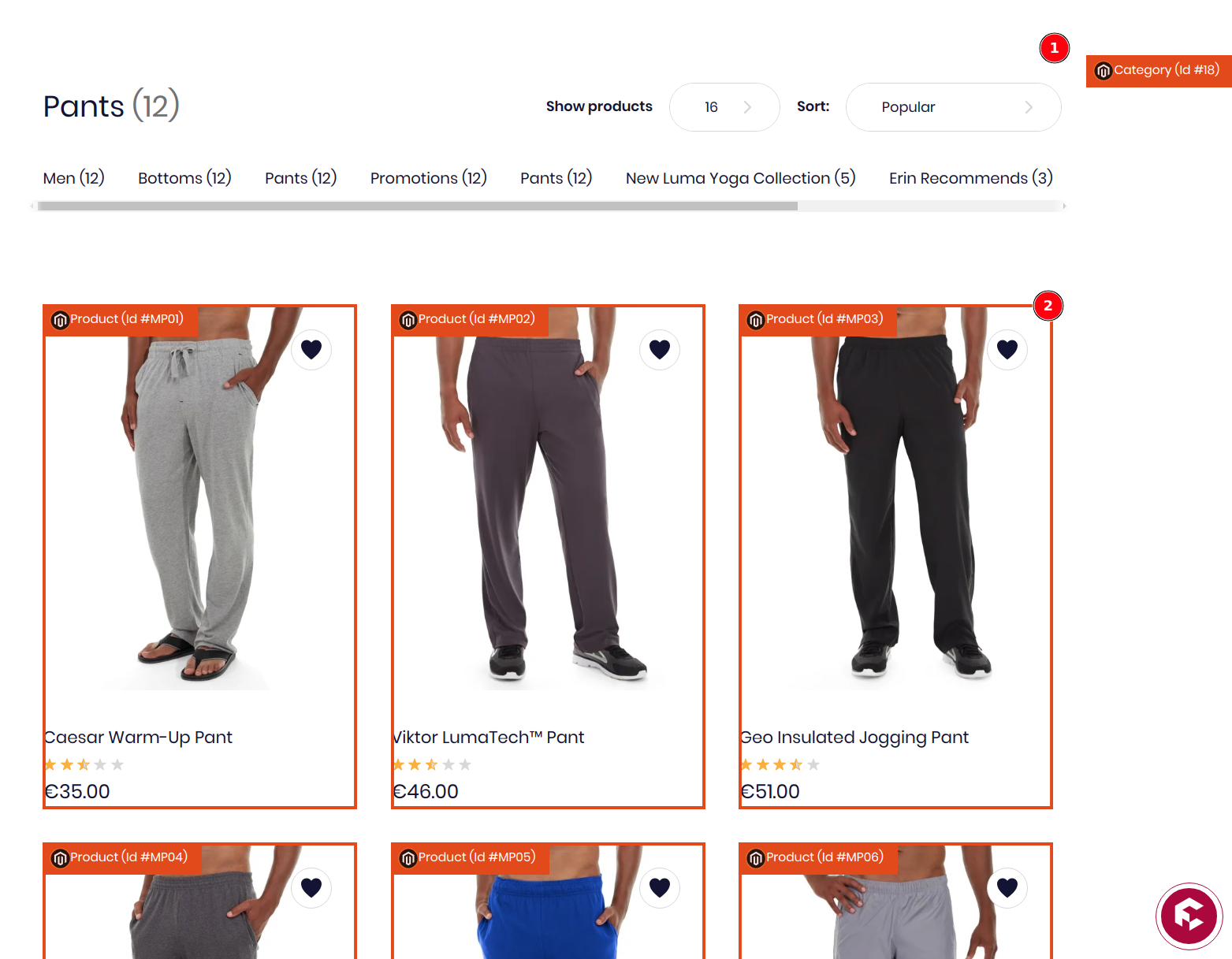
The screenshot below illustrates a page scope for the category (1) and block
scopes for product items (2):
Style a custom source
If your content comes from a specific source, you can configure a dedicated
color and icon for that source. For that, you can can override app-sources:
const anSvgIcon = /* … */

const customStyle = {
  name: "aCustomSource",
  color: "rgb(147, 74, 97)",
  icon: anSvgIcon,
}

export default [customStyle];